Affiliate Website on Spansih Travel Niche
Goals
Increase engagement, reduce bounce rate, and enhance page interaction: The first objective was to improve the website’s overall image and professionalism, aligning the color palette with the services offered. It was crucial for the website to not appear as an affiliate site but rather as a dedicated hotel portal. This approach aimed to regain lost positions in Google search results over the past few months. By achieving a more professional appearance, the client expected to increase the time users spent on the site and encourage interaction, ultimately improving overall engagement metrics.
Improve conversion rates: Offering a good design and user experience alone was not enough to achieve the second objective. The products (hotels) needed to be sorted based on the number of actual bookings made, as well as number of received. In other words, the first hotels displayed should have a higher conversion rate, while the least booked hotels should appear at the end. This seemingly obvious arrangement is often overlooked due to time constraints. Prioritizing hotels based on their conversion performance would enhance the likelihood of users making bookings and improve the overall conversion rate of the website.

Problem Statement
The importance of a good design in a website cannot be overstated. When a website is poorly designed, it can lead to a negative user experience and ultimately hurt the overall success of the website.
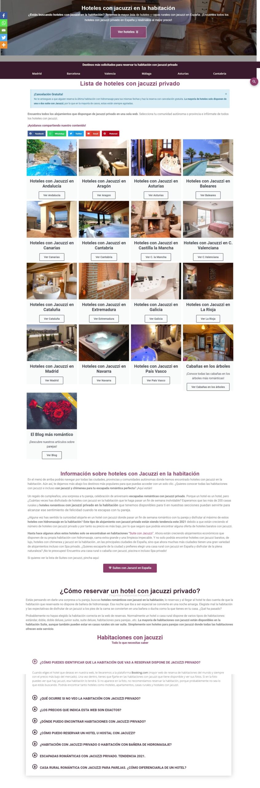
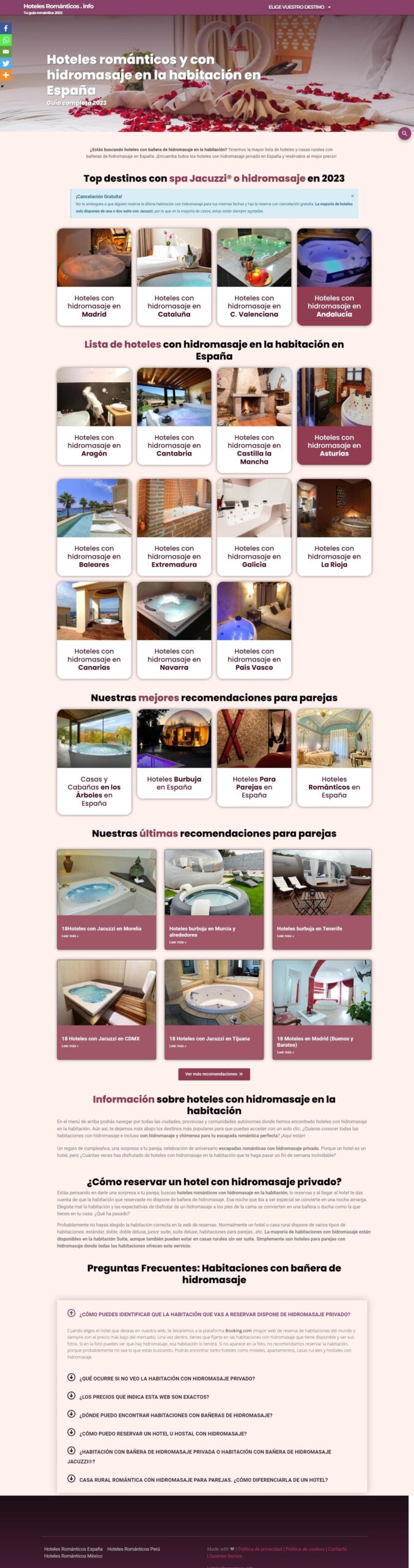
The old design had a number of issues including small letters, an unprofessional look, cluttered UI, low-quality pictures, and poor color combinations. However, these issues were recognized and addressed in the redesign process.
The background was plain white that did not add any characther to the website. On top of the website was full of other sugestions, which hovewer necesery for marketing purposes was unessesary to the clients and it was just confusing and cluthered the design.
The used colours did not comliment the site and were unmatching and unatractive.
Affiliate marketing has undergone significant changes in the past 5 years. It’s no longer sufficient to have a website solely focused on providing information about long-tail keywords, buying a few links, and expecting to earn money through AdSense or affiliate programs. The competition has intensified, and many sectors, including the one in this case study, have become highly competitive.
Unfortunately, this is precisely what happened to your client. They faced intense competition and struggled to stand out in their industry.
- The website was hitted by the Product Review Update in March 2022 and the Google Core Update in March 2023.
- Additionally, the website had a poor web design characterized by small font sizes, low-resolution images (300×200), absence of a cohesive color palette, inconsistent typography within the same page, and products listed randomly instead of being prioritized based on clickability.
- As a result, the website experienced low conversion rates.
UX Process
In today’s digital age, it is more important than ever to understand your customers when they visit your website. That’s why I decided to use the tool CrazyEgg.com so i get an inside into the user’s behaviour.
With CrazyEgg, I was able to track where customers were attracted to the page, which areas they spent the most time on, and when they would typically leave.
Additionally, I could see which parts of the page were clicked on the most and which parts were not so interesting for the cutomers and where was most interesting and they spent the most time looking.
Disclamer: Some of the decisions we made based on the data extracted from CrazyEgg.com
Changes
The affiliate button placement: We confirmed through A/B testing that placing the affiliate button just below the icon list, rather than below the text, yielded better results. Many users were not scrolling down enough to see the button, and they attempted to click on photos or titles without success. By relocating the button, we increased the chances of redirecting users to make a purchase.
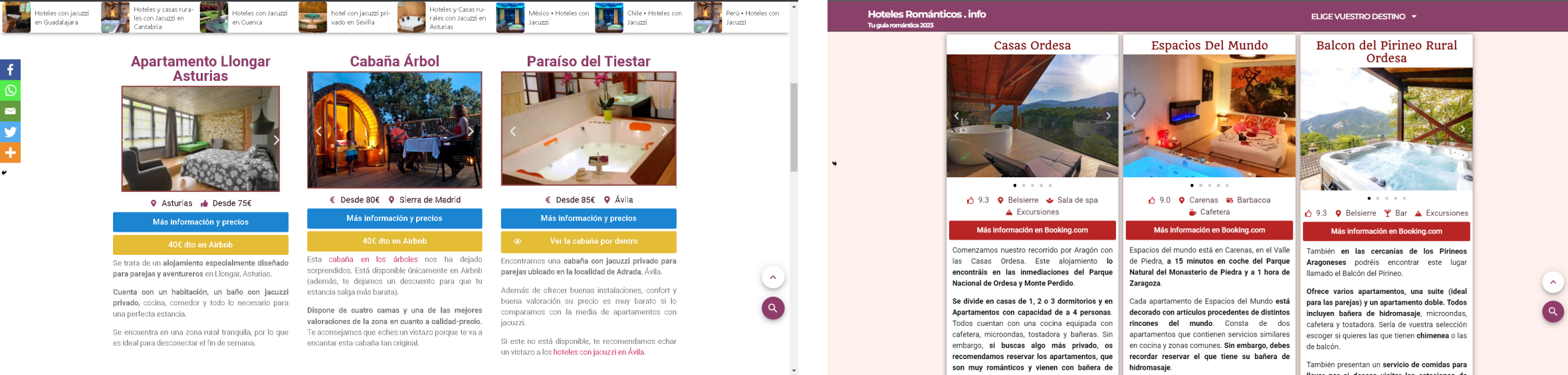
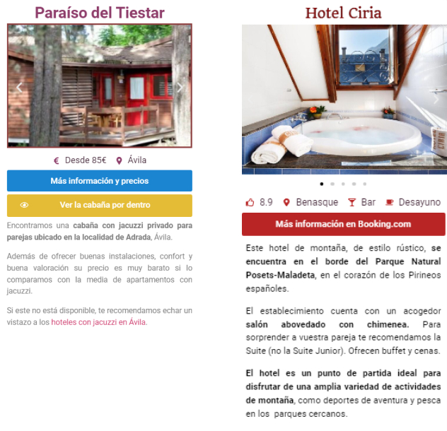
The importance of multiple photos: The client was unsure whether it was a good idea to include numerous photos (5, 6, 7, 8, or even 9 in some cases) due to potential loading issues. However, we concluded that more photos led to happier users, longer stay durations, and better conversions. Including additional photos allows users to have a better understanding of the room and the overall hotel. Redirecting them multiple times ensures that the hotel meets their expectations, increasing the chances of conversion.
User engagement with descriptions: Despite initial doubts, we discovered through CrazyEgg that a significant portion of users actually read sections of the descriptions. The client believed that users would not read descriptions extensively, which is why many affiliate websites have poor descriptions. With the right text highlighinh we were able to attract the customer’s attention to text as well.
Quick decision-making: Using the recording feature in CrazyEgg, we observed that some users wanted quick answers within seconds. They quickly scrolled down the website, rapidly assessed the available information, and clicked on the hotel that caught their attention, often without reading the full description. These users relied primarily on location, photos, and the summary of icons. Therefore, it is crucial to showcase the most appealing photos in the initial carousel to capture their attention promptly.
Google Analytics
Before displaying the actual statistics, I would like to express my gratitude to the webmaster for allowing me to share private data.
You can contact them through their website at https://hotelesromanticos.info/contacto/.
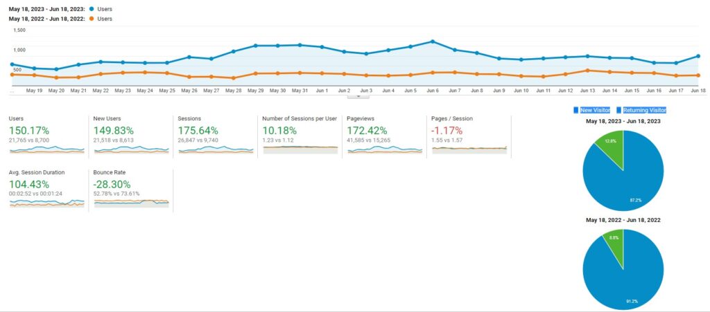
The statistics shown are from the same month but from different years to avoid issues with seasonality.
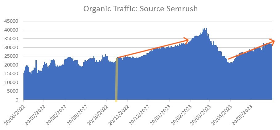
The project began with gradual design and UX improvements in November 2022 (yellow line). In April 2023, after experiencing a significant drop in traffic, the client decided to allocate more resources to improve at maximum speed.
As a result, there was an improvement in on-page statistics, position rankings, and conversions.
Key Performance Indicators (KPI)
Start Point:
May 18th 2022- Jun 18th 2022
- Page Views: 15.265
- Avg. Session Duration: 1:24
- Returning Visitor: 8.3%
- Bounce Rate: 73.61%
- Conversion Rate: 0,33%
Last Update:
May 18th 2023- Jun 18th 2023
- Page Views: 41.585 (Δ 172%)
- Avg. Session Duration: 2:52 (Δ 104%)
- Returning Visitor: 12.8% (Δ 52.38%)
- Bounce Rate: 52.78% (Δ 28.30%)
- Conversion Rate: 0,51% (Δ 51%)
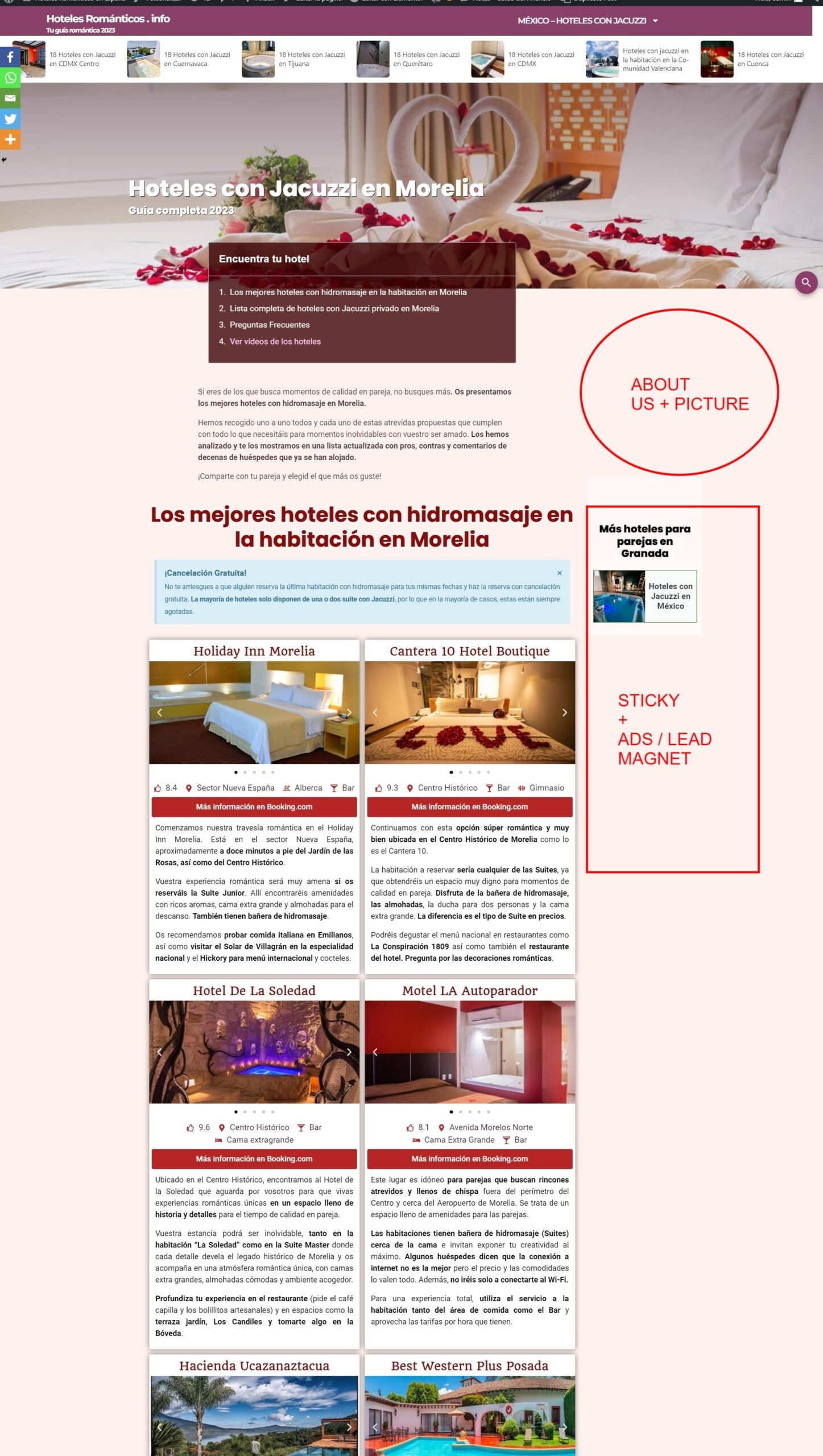
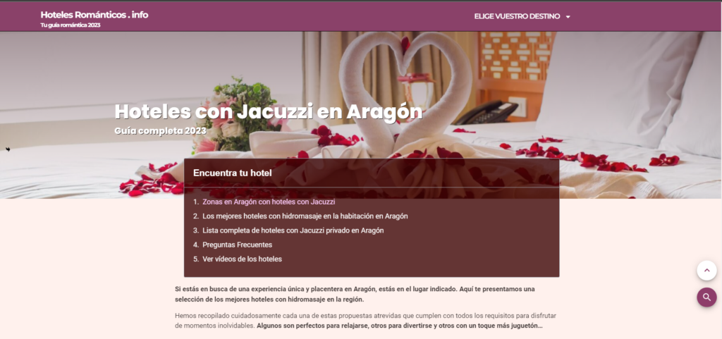
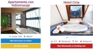
Homepage 2022
Homepage 2023
Conclusion
Good design and UX not only make websites look more professional but also make users feel more comfortable and secure while browsing, resulting in improved organic website ranking and increased conversions.
While I don’t have the average commission data per sale, it’s possible to make quick calculations to understand how successful hiring someone to improve the design and UX has been.
In May 2022, the website had 8,700 users and a conversion rate of 0.33%, which means there were 29 sales. Less than one sale per day!
In May 2023, the website had 21,765 users with a conversion rate of 0.51%, resulting in 111 sales.
Final Result
So even with a pessimistic outlook assuming no further improvements in traffic or conversions, the website would sell an additional 82 reservations per month, which equals 984 more sales per year.
If the trend continues and all the remaining URLs are further improved, along with creating new content based on these new foundations, it’s possible that within less than a year, the website could reach a monthly traffic of 40,000 users with a 1% conversion rate. That translates to 400 bookings per month, or in other words, a Δ 1,279% increase.
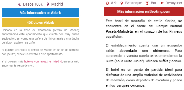
Product page 2022
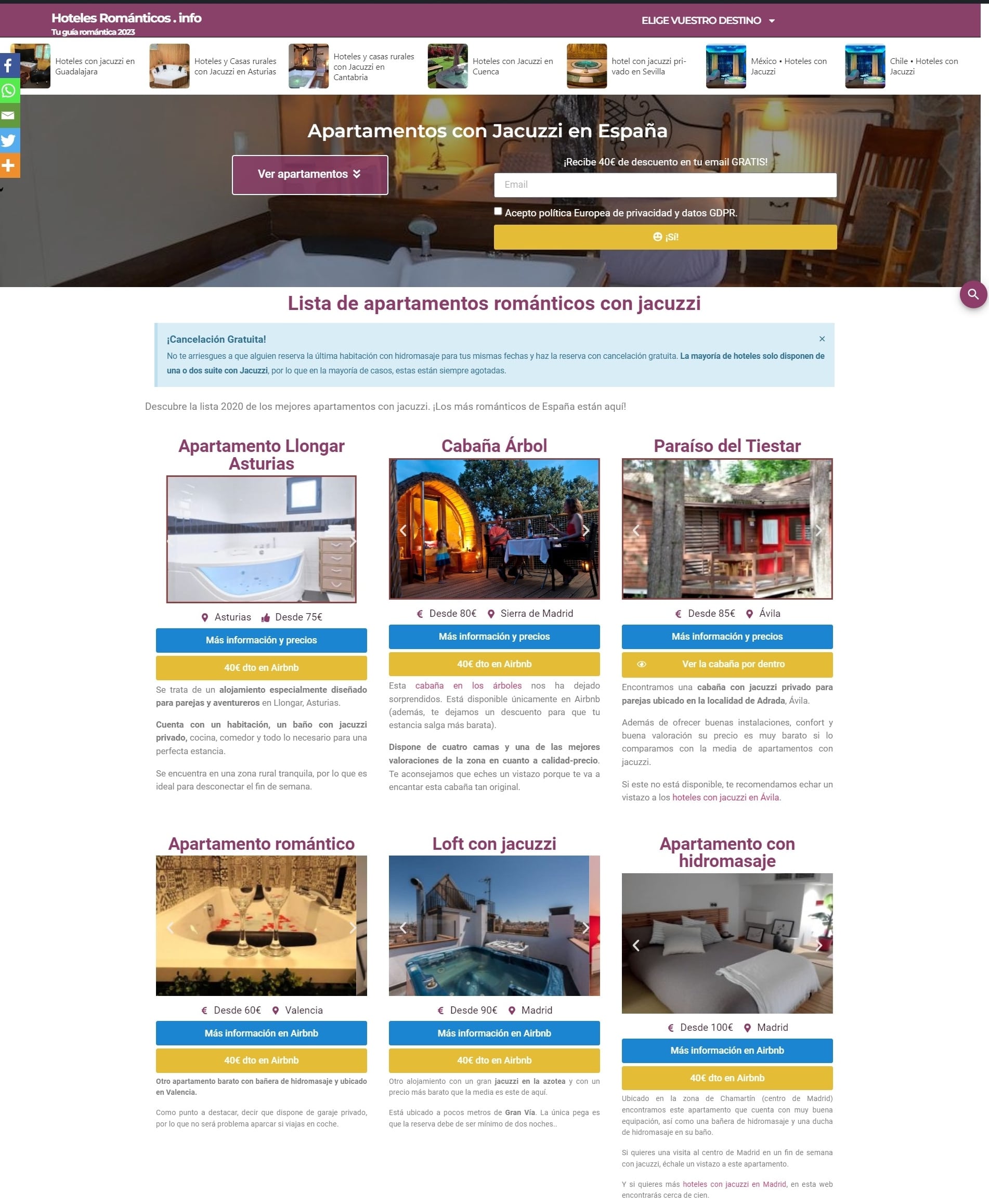
Product page 2023